デザイナーのとなりで仕事を見ている気分
「そのデザイン、どうやって作るの?」が分かる、デザインの参考書
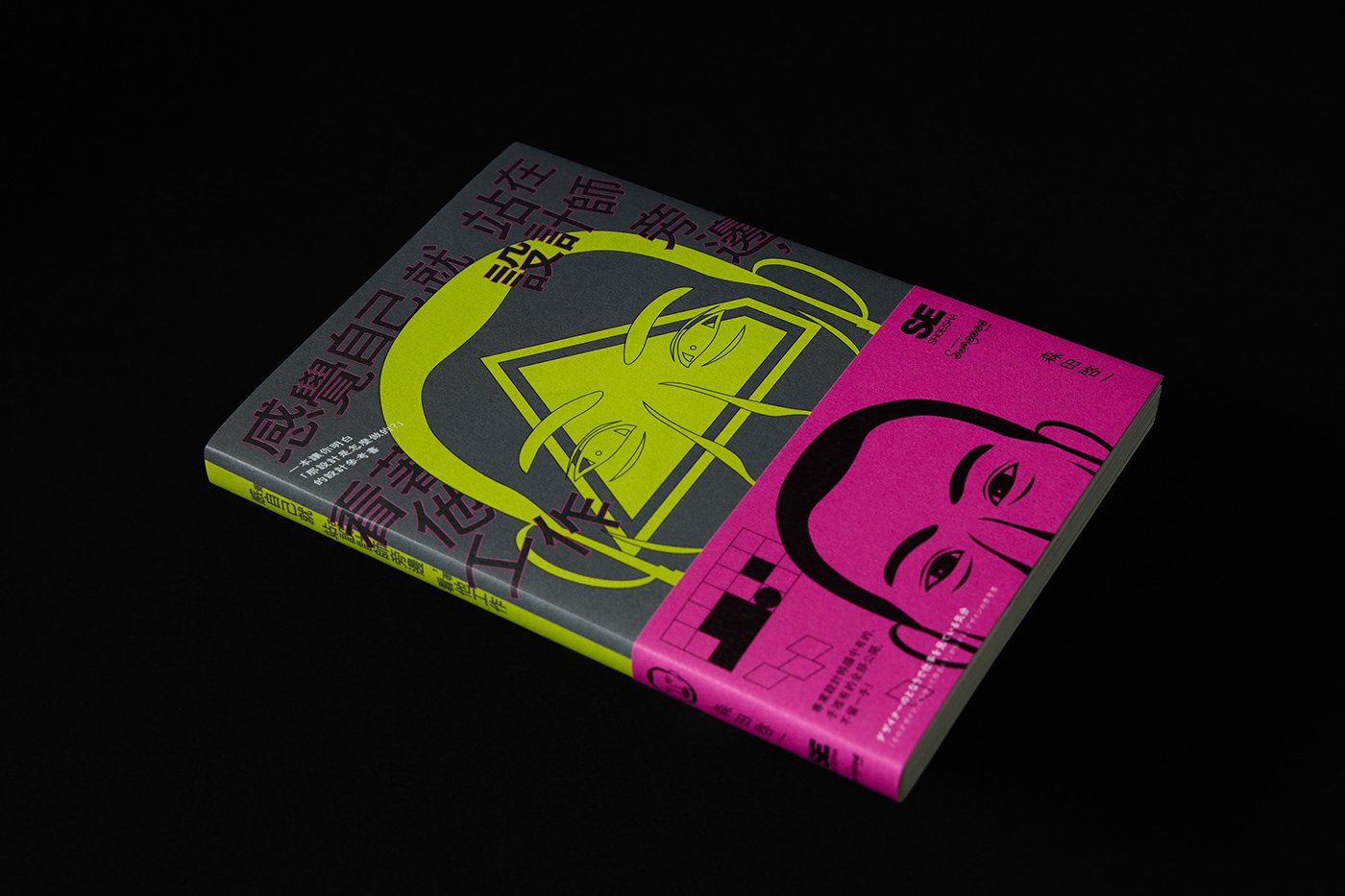
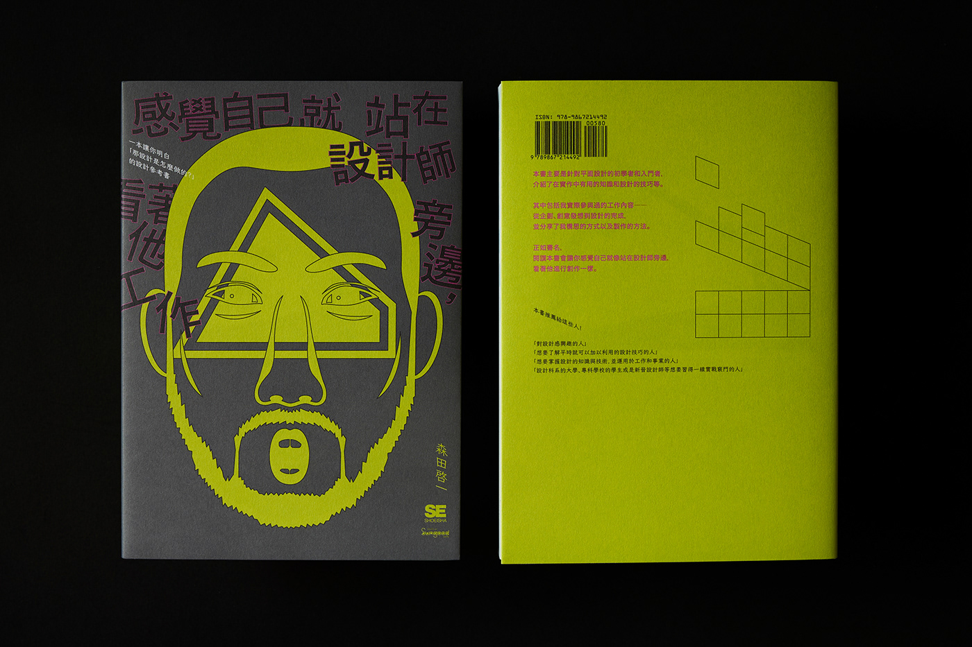
《感覺自己就站在設計師旁邊,看著他工作》
一本讓你明白「那設計是怎麼做的?的設計參考書」
_______________________________________________________________
作者 / 森田啓一 MORITA Keiichi
出版 / 桑格設計書店 , 譯者 / 劉京偉 , 封面設計 / 朱俊達 Chun-Ta Chu , 攝影 / 58KG


This book compiles the personal project experiences and case studies of designer Keiichi Morita into a practical design toolbook. It targets young designers who are new to the field, students, and workers from various industries related to design. The objective is to equip readers with a comprehensive understanding of different design project categories, aiding in future professional decision-making.
The traditional Chinese version's cover intuitively features the icon of Keiichi Morita's portrait as the visual core, creating a bridge between the book's visual appeal and its contents.
本書是透過設計師森田啓一的個人專案經驗以及案例,所彙整編撰的設計工具書。目標是針對剛接觸設計的年輕設計師、學生及跟與設計有關的不同產業工作者。使讀者在各設計專案類項中有個總體性的認知,利於未來職能上的判斷。
繁中版的封面是直觀將書中設計師的頭像icon作為視覺主體,做為書本視覺及內容兩者間的連結。

The visual concept, influenced by the book title, implies "Feeling as if you're standing next to the designer, watching him work," with "watching" and "working" as the key focal points. It strives to make the concept of "being watched" palpable to the viewer. This notion of "watching" extends beyond merely observing Morita's work; it's about experiencing the case studies as if Morita is personally guiding the reader, creating a sense of mutual dialogue between the designer and the observer.
Moreover, the design seeks to express the ideas of "working" and "being in the midst of work" through jumbled text layouts that reflect the dynamic process of designing or sketching. Additionally, grid elements found within the book are used as a visual extension, highlighting that design demands thoughtful consideration and strategic responses to needs. Thus, by incorporating grids, the design conceptualizes thoughts, learning, and processes as evolving symbols over time.
視覺概念因書名「感覺自己就站在設計師旁邊,看著他工作」以「看」和「工作」為兩大重點。希望觀者能明確感受到「被觀看」的這個概念,同時這個「看」不僅僅是看著設計師的工作,而是彷彿能跟著案例,如同設計師手把手親自教學,設計師也再看著我們,如同兩者再交互對話。
同時也希望表現出「工作」及「工作中」的概念,透過不規整文字拼合,展現如同正在工作中的設計過程或者是草圖樣貌。在此也利用書中有的網格元素作為視覺延伸,因書中設計師強調設計需要思考、需要因應需求注重策略等,所以將思考、學習、過程等概念,結合網格,做出如同思緒、帶有時間性過度的符號。


〈書籍購入〉
___________________________
〈用紙〉
書衣 / 恆成 日本艾若薇 151 g/m , 書腰 / 恆成 日本艾若薇 151 g/m , 書封 / 恆成 凝雪厚卡 330 g/m , 內頁 / 恆成 日標HUWA HUWA 105 g/m
書衣 / 恆成 日本艾若薇 151 g/m , 書腰 / 恆成 日本艾若薇 151 g/m , 書封 / 恆成 凝雪厚卡 330 g/m , 內頁 / 恆成 日標HUWA HUWA 105 g/m